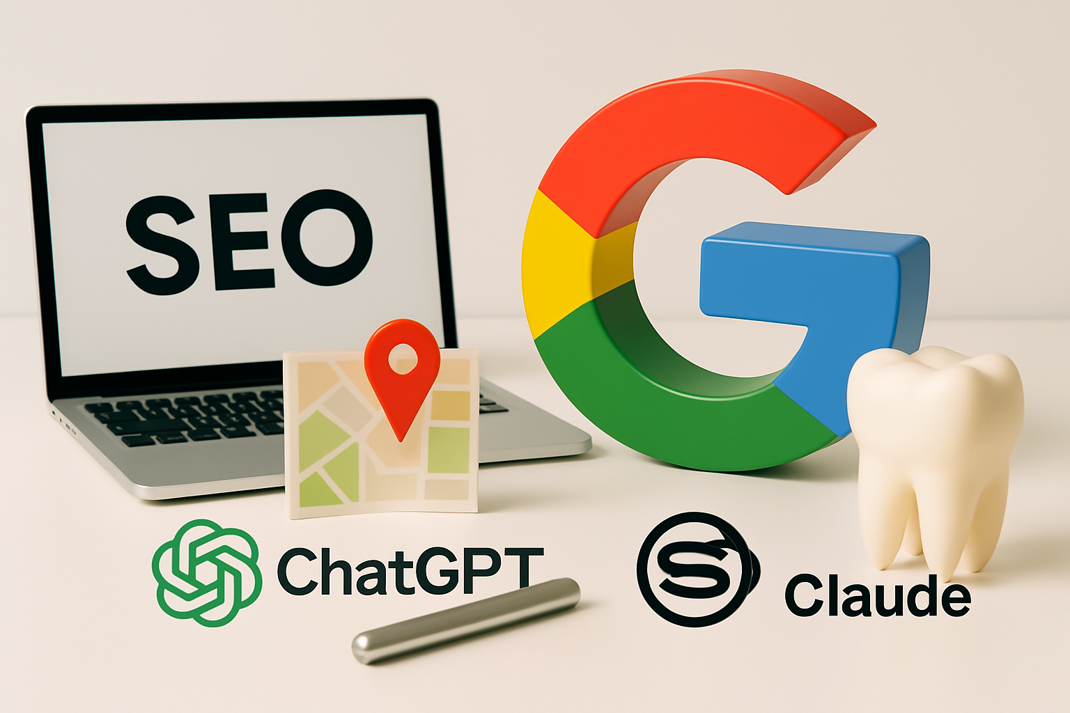
The 20 Best Dental Website Designs in 2026 (And What Makes Them Work)
Your dental website is your first impression — and in most cases, it's working (or failing) before you ever speak to a potential patient.
Think about it: a patient in your area searches "dentist near me," clicks your website, and within three seconds decides whether to book or bounce. That decision isn't random. It's driven by exactly what they see — and don't see — on your homepage.
We've spent years helping dental practices grow, and we've analyzed hundreds of dental websites across the country. The ones that consistently turn visitors into booked appointments share a specific set of design and content choices. The ones that don't? They all make the same predictable mistakes.
This list covers the 20 best dental website designs we've seen in 2026 — what each one does brilliantly, and what every dentist can learn from them.
What Makes a Great Dental Website?
Before the list, let's establish what we're actually judging. A beautiful dental website that nobody finds is a wasted investment. A website that ranks but doesn't convert is equally useless. The best dental websites do three things simultaneously.
They load fast. Google's data shows that 53% of mobile visitors leave a page that takes more than 3 seconds to load. For dental practices, where most patients search on their phones, page speed is directly tied to new patient volume.
They build trust instantly. Real photos of the actual doctor and team. Patient testimonials with names and photos. Credentials, association memberships, years in practice. Trust signals aren't optional — they're the difference between a call and a click-away.
They make the next step obvious. "Book an appointment" shouldn't require hunting. The call-to-action should be visible without scrolling, on every page, on every device.
With those criteria in mind, here are the 20 best dental websites in 2026.

1. Aspen Dental
Aspen sets the gold standard for corporate dental web design. Their homepage answers the three most common patient objections — cost, insurance, and availability — within the first scroll. The "We Accept Most Insurance" banner and "No Insurance? No Problem" messaging eliminate barriers before a patient can form an objection.
Key lesson: Address patient anxiety before it becomes a reason to leave.
2. Tend
Tend built their brand around making dental visits feel less clinical, and their website is a masterclass in that positioning. Clean, warm photography of real patients (not stock). A booking flow that takes less than 60 seconds. The copy reads like it was written by someone who actually dislikes going to the dentist — which is exactly who they're marketing to.
Key lesson: Brand voice and photography can completely change how patients perceive your practice before they set foot inside.
3. Smile Design Manhattan
For high-end cosmetic dentistry, this site earns trust through specificity. Before-and-after photo galleries with detailed case notes. Video testimonials from named patients. Technology pages that explain — in plain language — exactly what makes this practice different. Price anchoring through a "cosmetic consultation" CTA rather than a generic "book now."
Key lesson: Cosmetic and specialty practices need to demonstrate expertise, not just announce it.
4. The Super Dentists
Pediatric dental websites face a unique challenge: you're selling to adults (parents) while marketing to children. Super Dentists nails both simultaneously. The branding is fun and high-energy enough to excite kids; the homepage copy directly addresses the specific fears parents have about their child's dental experience. The FAQ section answers every question a new parent asks.
Key lesson: Know exactly who makes the appointment decision and speak to them — but don't alienate the patient in the chair.
5. Konikoff Dental Associates
Multi-location practices need to accomplish something tricky — feel local to each community while maintaining a unified brand. Konikoff does it with individual location pages that are fully built out (real team bios, community photos, local reviews) rather than thin duplicates. Each location ranks independently for "dentist [city]" terms.
Key lesson: If you have multiple locations, invest in real, unique content for each location page. Google treats thin duplicate pages as spam.
6. Pearl Dental Group
Pearl Dental's Brooklyn practice targets an extremely design-conscious urban demographic, and the site reflects that. Editorial-quality photography. Minimalist layout that feels more like a luxury spa than a dental office. Social proof embedded directly into the homepage — not buried on a testimonials page. Direct Instagram feed integration keeps the site feeling current.
Key lesson: Your website should reflect your patient demographic. Urban millennial patient base? Design accordingly.
7. Mobile-First Dental Design
The strongest mobile dental website experiences share one thing: the entire design is built mobile-first. Large tap targets, short forms, sticky call buttons. On mobile, "Call Now" follows you as you scroll. With 70%+ of dental searches happening on phones, this approach matters more than most practices realize.
Key lesson: Test your website on a phone, not a desktop. That's where your patients are.
8. Winn Family Dentistry
Winn Family Dentistry exemplifies what a strong independent general practice website should look like. Real family photos of Dr. Winn and team. Warm, personal copy that reads like it was written by someone who knows their patients by name. Patient reviews pulled directly from Google — not cherry-picked quotes on a static page. "New Patient Offer" prominently featured.
Key lesson: Authenticity converts. Stock photos of smiling strangers don't.
9. Atlanta Dental Spa
Positioning matters. Atlanta Dental Spa positioned their practice as a "dental spa" — and built their entire online brand around that differentiation. Spa-quality photography, relaxation-focused copy, and a homepage that explicitly addresses dental anxiety. They don't just offer sedation dentistry; their entire brand identity is built around the concept of a relaxing, spa-like dental experience.
Key lesson: The practices that grow fastest have a clear, specific positioning — not just "family dentist."
10. Bitesize Pediatric Dentistry
Pediatric dentistry done exactly right for a modern parent. The homepage loads under 2 seconds. Photography is all real patients (with proper releases) — no stock photos of children anywhere. The "What to Expect" section reduces first-visit anxiety for both parent and child. A strong blog section that answers parent questions drives significant organic search traffic.
Key lesson: A FAQ and blog section that answers the questions parents actually Google drives organic traffic that compounds over time.
11. Transparent Pricing Pages
The dental websites that convert comparison shoppers most effectively are the ones willing to be upfront about pricing — something most practices avoid, but which converts the patients who would otherwise bounce to a competitor. Pair pricing transparency with a clear "in-network insurance finder" on the homepage and you answer the single question that drives most appointment decisions.
Key lesson: Hiding your prices doesn't build trust. Showing them does.
12. Pacific Dental Services
PDS builds websites that are engineered for conversion. The online scheduling integration is seamless — patients can book without speaking to a human, which is increasingly what they prefer. Strong "about" pages per location build local trust despite being a large organization. A/B testing informs every design decision at scale.
Key lesson: Make it possible to book an appointment entirely online. More and more patients won't call — they'll just book with whoever lets them do it digitally.
13. Membership Plan-Forward Websites
Practices with in-house membership plans need a homepage that leads with the value proposition, not just the services. The solution to "I don't have insurance" should be front and center — above the fold, with clear pricing and a one-click sign-up. Short, punchy copy that respects the reader's time outperforms long paragraphs every time.
Key lesson: Membership and subscription dental models need a homepage built around the membership offer, not buried in a services dropdown.
14. Team-Focused Practice Websites
Small boutique practices can compete with DSOs on brand quality when they lead with personality. Team bios shouldn't be boring credentials — they should read like actual introductions from real humans. The "Meet the Team" page is consistently one of the highest-traffic pages for independent practices, because patients want to know the person they're about to let work in their mouth.
Key lesson: Invest in real team photos and actual personality-driven bios. This is one of the highest-ROI pages on any dental website.
15. Implant & Specialty Practice Websites
Specialty practices — implants, ortho, perio, oral surgery — need to justify their higher treatment costs online. The best ones do it through education-first content: detailed implant procedure pages that explain the process, timeline, and expected outcomes, video walkthroughs from the doctor, and patient stories specific to the procedure. They earn trust before the consultation ever happens.
Key lesson: The more expensive the treatment, the more educational content your website needs. Patients do more research before a $4,000 implant than before a cleaning.
16. Luxury Dental Brands
Luxury dental brand websites lead with experience, not procedures. A "5-Star Experience" positioning is front and center on the homepage. Before-and-after galleries are high-production and clearly demonstrate outcomes. Membership pricing is transparent. The booking flow is one of the smoothest in the industry — patients can select a location, procedure, and time in under 90 seconds.
Key lesson: Booking friction kills conversions. Remove every unnecessary step between "I want to make an appointment" and "appointment confirmed."
17. Access & Affordability-Positioned Websites
Practices serving price-conscious patients communicate that clearly on every page. "New patient special," "accepts most insurance," and "same-day appointments" are above the fold everywhere. They're not trying to compete on luxury — they're competing on access and affordability, and every element of the site reinforces that positioning. Nothing is buried; nothing requires scrolling to find.
Key lesson: Know your positioning and build your entire website around it. You can't be everything to everyone.
18. Video-First Homepages
Practices that invested in a short welcome video above the fold see measurably longer time-on-site and higher conversion rates compared to static image homepages. The video doesn't need to be Hollywood-produced — authentic and warm works. A 60-second welcome from the doctor makes an immediate personal connection that no amount of copy can replicate.
Key lesson: A 60-second welcome video from the doctor converts better than almost any homepage copy change.
19. Age-Organized Pediatric Websites
Practices serving pediatric patients from infancy through teens face a complex navigation challenge — parents' concerns change dramatically across that age range. The best solution is organizing content by age group rather than by procedure. Parents of a 2-year-old and parents of a 14-year-old find what they need immediately, without having to decode dental terminology to figure out where to click.
Key lesson: Organize your website content around how your patients think, not around how your practice is structured internally.
20. Digital Floss Dental Websites
We saved spot #20 intentionally — because every site we build is designed to hit every benchmark on this list. High-production video above the fold (the single highest-converting homepage element in dental). Prominent calls to action on every page so patients always know their next step. Load speeds that pass Google's Core Web Vitals. A blog written specifically for SEO and AI search visibility so the site keeps generating traffic long after launch.
The piece most practices miss — and the one that turns visits into revenue — is seamless lead capture. Our sites integrate directly with Go High Level, so every form fill, every contact request, and every "book now" click flows into your CRM automatically. No missed leads. No manual follow-up gaps. Every patient who lands on your site and raises their hand gets followed up with.
Most dental websites are built once and forgotten. Ours are built to rank, built to convert, and built to capture every lead.
Key lesson: Design gets patients to your site. GHL integration makes sure none of them fall through the cracks.
What All 20 Sites Have in Common
Looking across all 20 examples, seven elements show up on every high-performing dental website:
- Real photography of the actual team — not stock photos, not generic smiling faces. Real photos of the real doctor and real staff.
- Load speed under 3 seconds on mobile — if you're failing Google's Core Web Vitals, you're invisible to patients who searched for you.
- Online booking that actually works — if patients can't book without calling, you're losing everyone who won't call.
- Clear, specific patient reviews — "Great dentist! 5 stars" doesn't convert. Specific reviews with names and outcomes do.
- An obvious next step above the fold — on desktop and mobile, the patient should never have to scroll to find how to contact you.
- An FAQ section that answers the real questions — "Does it hurt?" "Do you accept my insurance?" "What should I bring?" Answer these and reduce the friction that stops patients from booking.
- CRM integration for lead capture — a great website that doesn't capture and follow up on leads is leaving new patients on the table every single day.
How to Get a Dental Website That Actually Grows Your Practice
Most dental websites were built once and haven't been touched since. They don't rank on Google. They don't convert visitors. And every month they're live, they're costing the practice new patients who went to a competitor with a better site.
Digital Floss builds dental websites that do the opposite. For $500/month, your practice gets a professionally designed dental website with video above the fold, conversion-optimized CTAs throughout, fast mobile performance that Google rewards, a blog written for SEO and AI search visibility, and full Go High Level integration so every lead is captured and followed up automatically.
No more "they filled out the form but nobody called them back." Your website works around the clock — and so does your CRM.
Ready to see what a Digital Floss website looks like? Book a website consultation today.